Have you ever wondered why certain colors evoke certain feelings and moods? The colors you choose for your home’s interior design have a significant psychological impact. Whether you want to ignite passion in the bedroom or encourage productivity in the home office, understanding colour psychology in interior design can help you create the perfect ambiance in each space.
In this guide, we’ll explore how primary, secondary and tertiary colors influence emotions and behaviors. We’ll also look at the differences between warm and cool colors and how cultural associations shape our perceptions. Armed with this knowledge, you’ll feel empowered to choose colors that reflect who you are and support your lifestyle needs. Follow along as we discuss how to bring warmth to your living room, enhance intimacy in your bedroom, promote cleanliness in your kitchen, and reduce stress in your home office — all through the strategic use of color psychology in home interior design.
1- Understanding the Colour Psychology in Interior Design
When it comes to colors, every shade has meaning. The colors you choose for your home can affect your mood and mental state. Let’s see how to use colour psychology in home interior to get the best results.
- Red is energetic and bold. It increases heart rate and boosts excitement. Use it in your home office or entryway for motivation.
- Blue is calming and soothing. It lowers blood pressure and heart rate, perfect for bedrooms. Different shades like navy or teal work well for living rooms and dens too.
- Green is natural and refreshing. It relieves stress and boosts creativity. Add pops of green in your kitchen, bathroom or any space where you want to feel rejuvenated.
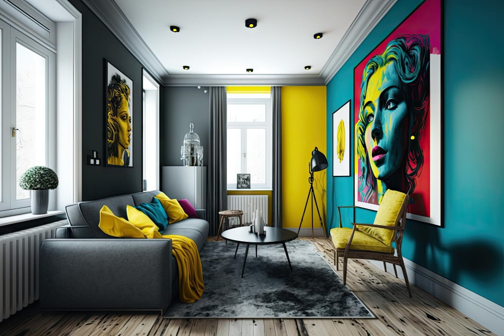
- Yellow is cheerful and bright. It stimulates happiness and optimism. A yellow accent wall or accessories will instantly lift your mood. But use it sparingly, as it also increases anxiety.
- Orange blends the energy of red and the cheer of yellow. It’s an mood booster and appetite stimulant ideal for kitchens or casual living spaces.
- Purple is luxurious and imaginative. Use shades of violet, plum or eggplant in your bedroom or creative studio. But too much can seem overindulgent.
Play around with different color combinations in your home. Mixing complementary colors like blue and orange or triadic colors like red, yellow and blue creates visual contrast. And remember, the colors that make you happy are the right ones for your home.
2- How Warm and Cool Colors Affect Your Mood
Want to evoke certain moods in your space? Warm and cool colors are the way to go.
Warm colors like red, orange, and yellow energize and stimulate. They advance visually, making a space seem cozy and intimate. Use them in your living room or bedroom to create a welcoming vibe.
Cool colors such as blue, green and violet have a calming, relaxing effect. They recede visually, making a space appear more open and airy. Use them in your home office or bathroom for a spa-like feel.
Combining warm and cool colors also works well and adds visual contrast. For example, paint your walls a cool grayish blue and add warm red accent pillows and rugs. Or paint your kitchen cabinets a vibrant red-orange and pair them with pale green countertops.
The colors you choose significantly impact your mood and productivity. By understanding how different hues affect you personally and culturally, you can create the perfect color palette for your home. After all, your space should reflect and enhance your lifestyle. What better way to achieve it than through the colour psychology in interior design?
3- Using Color Psychology in Interior Design
a- Use Color Psychology to Influence Mood
The colors you choose for your home can affect your mood and mindset. Cool blues and greens are calming and help reduce stress, while warm reds and oranges energize and stimulate creativity. Be creative and make the most use of colour psychology in home interior while decorating. You will not believe how our mind, upon being understood properly can make us so happy.
- Consider painting your home office a cool blue to help you focus, or select a red accent wall to boost motivation.
- For high-energy spaces like living rooms or playrooms, warm yellows and oranges are inviting and cheerful.
- Grays, tans and muted greens work well for bedrooms since they evoke feelings of relaxation and tranquility.
Choose colors that make you feel good and reflect the vibe you want for each space. The shades you select can influence both your own mood as well as the moods of guests in your home. Paying attention to colour psychology in interior design helps you create an ideal environment tailored to your needs and preferences.
b- Choosing Colors for Your Living Room: A Cozy and Welcoming Space
For your living room, choose a color palette of warm, inviting hues. Warm colors like reds, oranges, and yellows evoke feelings of warmth and comfort.
Stick to a complementary color scheme of analogous colors, such as red, orange and yellow or red, orange and terracotta. These hues blend together nicely and create a harmonious space. You can also incorporate accent colors from the complementary color wheel, such as greens, to add visual interest.
Include natural materials like wood, wicker, cotton and wool in your decor and furnishings. Natural fibers and textures complement a warm color scheme and make a space feel cozy and relaxed.
Consider a feature wall in a rich, dramatic shade of red or burnt orange. A colorful accent wall draws the eye and creates a focal point in the room. For the remaining walls, choose a lighter, tinted version of the accent color or a neutral beige or cream.
Lighting also helps set the right mood. Use lamps, spotlights and pendant lights to create a warm, ambient glow. Dimmer switches allow you to control the brightness and set the perfect level of lighting for any activity.
A mix of patterns, textures, and decorative accessories like throw pillows, rugs, artwork and houseplants help complete the welcoming vibe in your living room. Keep patterns and colors cohesive for a coordinated look.
With a warm color palette, natural accents and the right lighting, your living room will become a cozy space for relaxing and entertaining. Your guests would be curious how colour psychology in home interior works also, may never want to leave!
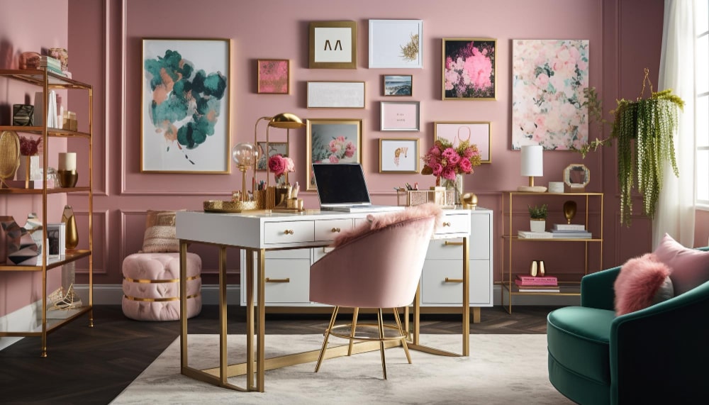
c- Picking Colors for an Productive Home Office
For a productive home office, choose colors that reduce distractions and energize your mind. Stick to a minimal color palette of 2-3 complementary colors.
Blues and Greens
Blues and greens are ideal for a home office. These colors are calming and help increase focus.
- Deep teal or navy blue walls with accents of seafoam green create a soothing space.
- A pale blue-gray desk and bookshelves against a sage green wall is a harmonious color combination.
Avoid Warm Colors
- Warm reds, oranges and yellows energize and stimulate creativity. While great for other areas of the home, they are too vibrant and distracting for an office.
- If you want to incorporate warm accents, do so sparingly with natural wood furnishings, woven baskets or terracotta planters.
Natural Lighting
Maximize natural lighting in your home office with large windows. Natural light helps set your circadian rhythm and boosts productivity. It is about all the elements we need to live a peaceful life and not only about colour psychology in home interior.
- Place your desk near a window for the most illumination.
- If possible, choose a room with windows on multiple walls for the airiest feel.
Artwork
Keep artwork minimal and avoid clutter. Choose simple nature prints, black and white photos or minimalist prints with cool tones.
- One large statement piece behind your desk is ideal.
- Group 2-3 smaller prints on one wall for a cohesive gallery look.
With a restrained color palette, plentiful natural light and minimal distractions, your home office will become an oasis of productivity. You’ll be cranking through that to-do list in no time!
d- Bedroom Colour to Promote relaxation and restful sleep
When choosing colors for your bedroom, aim for shades that evoke feelings of calm and relaxation. After all, your bedroom is your sanctuary where you unwind and rest at the end of the day.
Soothing Cool Tones
Cool tones like blue, green, and violet have a calming, serene effect. Shades of blue in particular can lower blood pressure and heart rate, making them ideal for restful sleep. Consider pale blue, navy, or steel blue accent walls or bedding. Sea green and plum also create a tranquil ambiance.
•Pale blue: Peaceful, calming. Lower blood pressure.
•Navy: Sophisticated, anchors the space.
•Sea green: Relaxing, refreshing.
•Plum: Royalty, luxury. Sense of escape.
Warm Natural Tones
Earthy tones connect us to nature and ground the space. Shades of brown, tan and terra cotta give off warm, cozy vibes. A warmer neutral on the walls with natural wood accents help make the bedroom a comforting retreat.
- Beige or cream walls: Light, airy, expansive.
- Wood accents: Organic, timeless.
- Terracotta accessories: Rustic, nurturing.
A combination of soothing cool tones and warm natural shades create a balanced, harmonious bedroom design. Keep patterns and textures minimal, and avoid bright accent colors which can stimulate the senses before bedtime. Your bedroom should reflect the peace and tranquility you want to experience at the end of each day.
e- Kitchen Colour to Stimulate appetite and creativity
When choosing colors for your kitchen, consider hues that stimulate your appetite and creativity.
Warm, Rich Tones
Colors like red, orange and yellow are warm and energetic. Painting your kitchen walls in shades of terra cotta, peach or mustard will make you feel cozy while cooking and motivate you to try new recipes. These dynamic colors also increase your heart rate and metabolism, so you may find yourself whipping up meals more quickly!
Contrasting Accents
Once you have a warm base color for your kitchen, add visual interest with contrasting accents in your decor, linens or cabinetry. For example, if your walls are a vibrant red-orange, choose kitchen towels, placemats or chair cushions in forest green. Or paint your cabinets a deep teal or navy blue. The energetic warmth of the walls combined with the cool contrast of the accents will make your kitchen a place you love spending time in.
Consider Cultural Associations
The colors you choose may also depend on the type of cuisine you like to cook. For an Italian-inspired kitchen, shades of tomato red, basil green and sunflower yellow would be perfect. If you prefer Asian-fusion fare, paint your walls in spicy chili pepper red or Szechuan orange with accents in seaweed green. Let the colors reflect the flavors of your favorite foods!
4- Popular Colors and Their Effects in Home Interiors
Have you ever walked into a room and felt an instant mood shift? The colors in a space can have a huge impact on how you feel in your own home. The colors you choose for your walls, furnishings and decor have the power to energize or calm you. They can lift your mood or bring you down. Knowing how different colors affect you can help you create the perfect feel in each room of your house.
Whether you want an energetic space to get you going in the morning or a tranquil oasis for relaxation at night, there’s a color for that. The psychology of color is a powerful thing. In this article we’ll explore how some of the most popular interior colors—blue, red, yellow, green, purple, white, gray and pink—can influence the way you feel in your home. You’ll gain insights to help you choose colors that support your desired mood and ambiance in each space. The colors you live with every day matter more than you might realize.
a- The Calming Effect of Blue in Your Home
Want to create a calming space? There’s no better color than blue. Studies show blue actually lowers blood pressure and heart rate, releasing relaxing chemicals in your brain.
Adding blue accents in your home is an easy way to bring tranquility to any room. Try navy blue throw pillows on the couch or a pale blue area rug in the living room. For the bedroom, a blue bedspread and curtains are perfect.
- Paint an accent wall in your favorite shade of blue. A rich navy or bright azure will give the room an instant pop of color.
- Include natural touches like a vase of blue hydrangeas. The contrast of the colorful blooms against green leaves enhances the calming effect.
- Use lighting with a cool blue glow, like a Himalayan salt lamp. The soft illumination creates a spa-like ambiance ideal for unwinding at the end of the day.
Blue is considered a restful and peaceful color for good reason. Whether through paint, textiles, or accessories, adding blue to your living space will turn your home into a personal oasis of tranquility. Your mind and body will thank you.
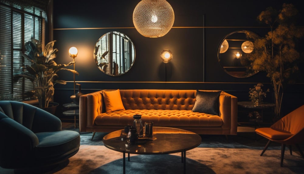
b- Energizing Red Accents
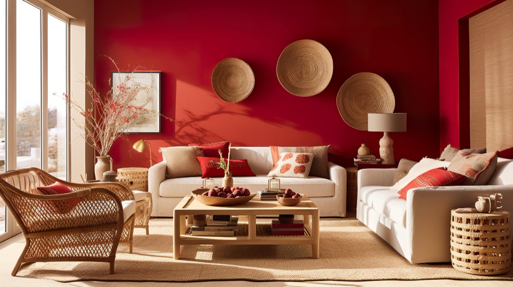
Want an easy way to energize your space? Add accents of red. This power color is known for increasing heart rate and stimulating excitement.
Use red in small doses, like:
- Throw pillows on your sofa or chairs. Two or three red pillows can make a big impact without overpowering the room.
- A vase filled with red flowers. Whether roses, tulips or gerbera daisies, red blooms will brighten up your living room or kitchen table.
- Kitchen accessories like a toaster, blender or coffee maker. A red appliance amidst an otherwise neutral kitchen provides a fun pop of color.
- candles. Group a few red candles together on a table or shelf for an eye-catching display. Their warm glow will make the space feel cozy and vibrant.
- A rug. Place a red rug in an entryway or under a coffee table to anchor the space. The bold color will make the room feel complete.
With the energizing power of red, your home will feel warm, exciting and ready for entertaining. But remember, moderation is key – use red accents in balance with calmer hues for a harmonious space. A little red goes a long way!
c- Cheerful Yellow: A Ray of Sunshine
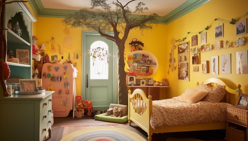
Yellow is the color of sunshine and cheer. Using yellow in your home’s interior design will brighten the space and lift your mood.
Yellow stimulates creativity and optimism. A yellow room feels warm and cozy, perfect for socializing or brainstorming new ideas. The vibrant energy of yellow inspires an upbeat, positive vibe.
Shades of yellow, from pale lemon to rich amber, pair well with blue, green and red. For a bright, vibrant look, combine yellow with complementary colors from the opposite side of the color wheel, such as shades of purple or blue-gray. Tone down intense yellows with wood tones, white or gray.
Incorporate yellow through accents like throw pillows, rugs, lamps or artwork. Paint one accent wall yellow for a pop of color without overwhelming the space. For a cheerful kitchen or family room, yellow cabinets or an entire yellow room may suit. But use yellow sparingly in bedrooms where it may be overstimulating.
A little yellow goes a long way, so choose your shade wisely. Softer yellows like lemon or buttercup are uplifting but relaxing. Brighter yellow-oranges and yellow-greens have higher energy and may irritate. Test how different yellows make you feel and trust your instincts. When it comes to colour psychology in interior design, a happy medium is ideal.
d- Green: A Fresh, Natural Shade
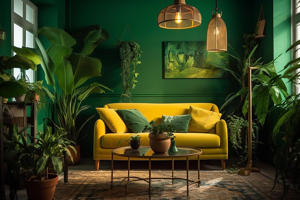
Green is a refreshing color that brings nature indoors. It has a soothing, calming effect and helps reduce stress and anxiety. Green also symbolizes growth, renewal and good health.
- Paint an accent wall in your living room or bedroom green for an instant pop of color. Match it with natural wood accents for a cozy cottage feel.
- Add green houseplants to naturally bring the color into your space. Snake plants, pothos, and succulents do well indoors and require minimal maintenance.
- Use green in small doses with throw pillows, rugs, blankets or other accessories. Olive green and forest green work well for a natural look.
- In the kitchen or dining room, green glassware, linens or serving pieces create an inviting space for entertaining.
- Mint green and sage are lighter, brighter options if you prefer a more pastel palette. Pair them with creams or grays for a relaxing oasis.
Whether deep emerald or soft seafoam, green is always a breath of fresh air in the home. Let it enliven your interior for a escape to nature without leaving the comfort of your own home. By incorporating natural motifs and materials, the color green turns any ordinary space into a peaceful retreat.
e- Purple: A little Bold
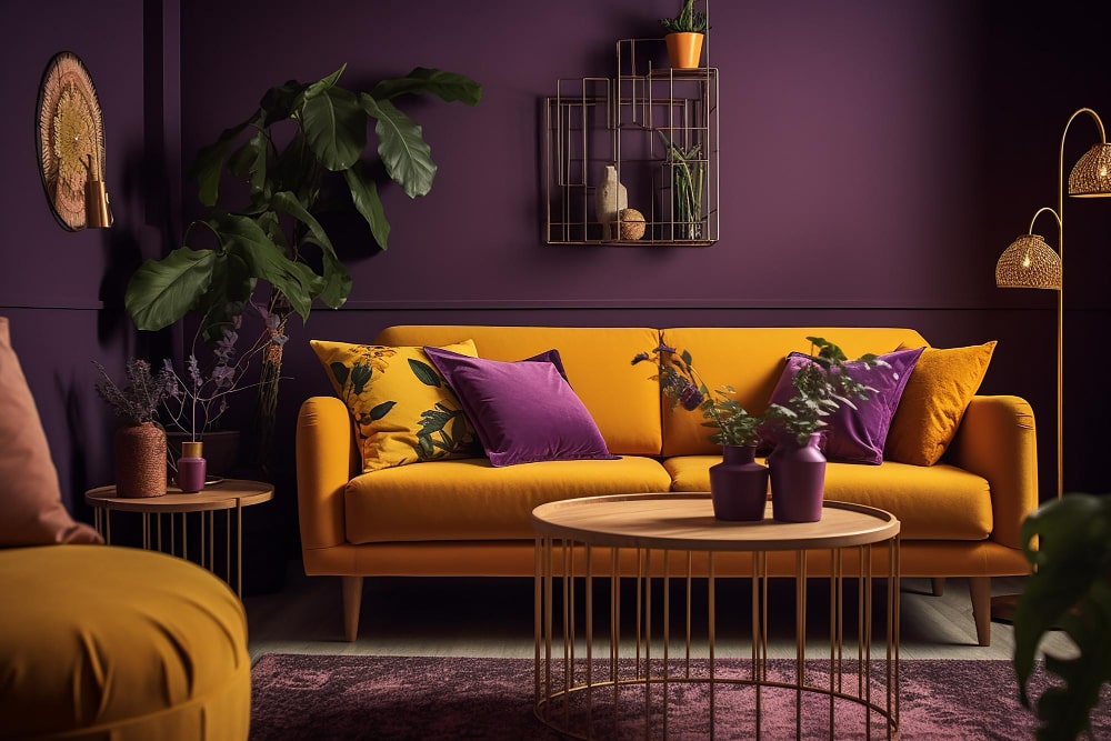
Purple is a bold and dramatic color that makes a statement in any space.
Deep, Dark Hues
Opt for deep, eggplant purples or wine-colored shades to create an opulent, luxurious feel. These darker purples pair well with metallics like gold or silver for an elegant, regal look. They also contrast nicely with creamy off-whites.
Lighter Lavenders
For a soothing, calming vibe, choose a lighter lavender or periwinkle. These pastel purples create a whimsical, dreamy quality and work well in bedrooms, bathrooms or living rooms. Pair them with grays, pale blues or mint greens.
- Softer purples can make smaller rooms appear more open and airy.
- Add pops of purple with throw pillows, rugs, blankets or towels.
- Group different shades of purple together for a dramatic ombre effect.
Whether you opt for plum, violet or lilac, purple packs a colorful punch and brings a sense of individuality and nonconformity to a space. Use it sparingly in smaller accents or go bold with dark, dramatic walls. However you choose to incorporate it, purple is sure to make a stylish statement.
f- White: Most Popular & Classy
Crisp & Clean
White is a perennial favorite for home interiors because it provides a crisp, clean backdrop for any style of decor. When used on walls, ceilings, trim, and cabinets, white makes a space seem more open and airy. It reflects lots of light, brightening even the darkest of rooms.
White also serves as a perfect neutral canvas, allowing the true stars of your space—like artwork, furnishings, architectural details—to shine through. You can easily change up the look and feel of an all-white room just by switching out accent pieces, pillows, rugs, and accessories in different colors.
Timeless & Versatile
Choosing white for your home interiors is a decision you’ll never regret. Its timeless, classic style transcends trends, allowing you to update the look of a space with minimal fuss. White works with every decorating style, from traditional to modern. It provides a cohesive flow when used throughout a home but also pairs well with every other color under the sun for contrast.
Whether stark white, creamy off-white, or somewhere in between, adding this versatile neutral to your walls, trim, ceilings or cabinets will give you an elegant yet low-maintenance blank canvas you can build upon for years to come. White truly is the little black dress of interior design.
g- Grey: A Royal Choice
Gray is a timeless and sophisticated color that adds a royal touch to any space.
A Classic Shade
Gray has been used in home design for centuries and is considered a classic, neutral shade. From charcoal to dove gray, the cooler tones are especially popular in modern and contemporary interiors. The gray color family is extremely versatile and pairs well with almost any accent color.
Calming Yet Stylish
Gray evokes feelings of calmness and relaxation. At the same time, gray color schemes can also look very chic and fashionable. Use darker shades of gray for a cozy, cocooning effect in the bedroom or living room. Lighter grays like pewter or silver create an airy, spacious feel and work well in small rooms.
Flexible Accent Colors
Gray serves as an ideal blank canvas and backdrop for pops of color. Bright accent colors like red, yellow and teal bring gray walls and furnishings to life. For a more monochromatic look, accent with other neutrals such as cream, taupe or blush pink. Metallic gold or rose gold accents also pair beautifully with gray for a glamorous, stylish space.
Overall, gray is a highly flexible and functional color for home decor. By combining different shades of gray and adding the right accent colors, you can create a restful retreat or a fashion-forward space that suits your unique style. Gray truly is the new black in interior design.
h- Pink: Pretty and Specific
Pink is a fun, vibrant color that evokes feelings of romance, playfulness, and youth. However, its brightness means it should be used carefully in home interiors.
Strong and Stimulating
The color pink activates the senses and stimulates energy. Vibrant pinks, like fuchsia and magenta, can make a bold statement in any room. However, these intense shades are best used as accents since they may feel overpowering on walls or large furniture.
- Muted pinks, such as blush or rose, have a softer, more romantic feel. They work well for wall colors in bedrooms, living rooms, and nurseries.
- Salmon and coral pinks create a warm, tropical vibe. Use them in small doses, such as decorative accessories, pillows, rugs, and art.
Complementary and Contrasting
For the most visually appealing look, pair pinks with complementary colors like green, or contrasting shades of blue or gray.
- Forest green, mint, and sage beautifully accentuate the fresh, youthful essence of pink.
- Navy blue adds a bold contrast that helps pink pop.
- Charcoal gray balances out the sweetness of pink and lends a more sophisticated touch.
In the right doses and combinations, pink can make a stylish and joyful statement in your home. But use it sparingly, especially the vibrant and intense shades, to avoid an overly feminine or juvenile feel. With the perfect complementary or contrasting color scheme, pink’s playful charm really shines through.
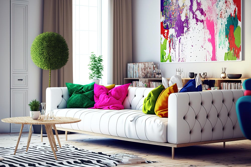
5- Applying Color Schemes and Combinations in Interior Design
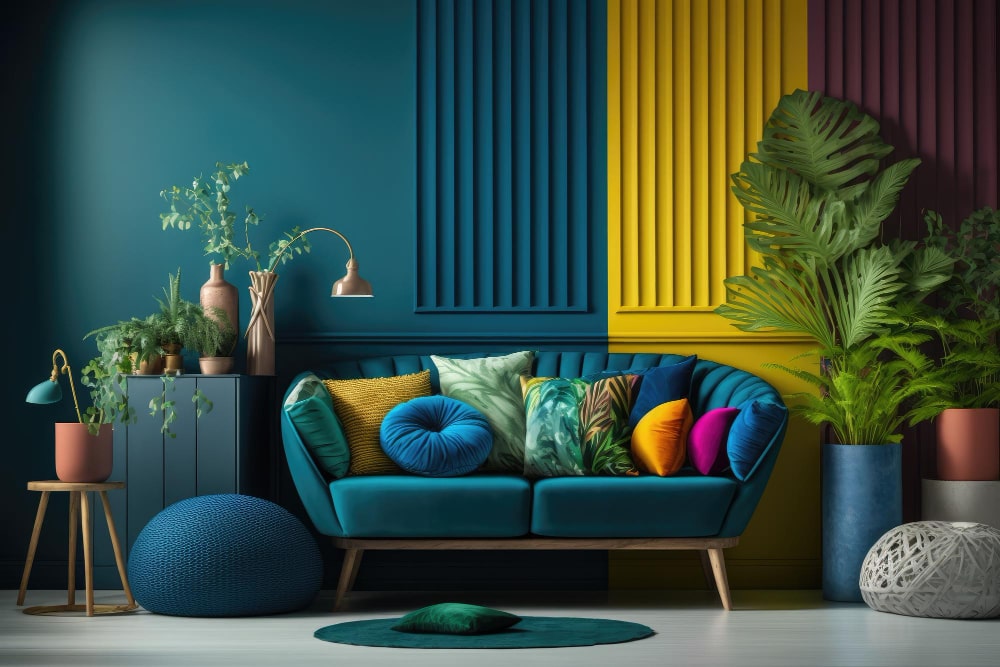
When selecting colors for your home, color schemes are a great way to create harmony. Two complementary colors opposite each other on the color wheel, like blue and orange, create high contrast.
a- Analogous color schemes
Use colors adjacent on the wheel, like blue, blue-green, and green. These harmonious trios suit restful bedrooms or living rooms. Choose one dominant color and use the others as accents.
b- Triadic color schemes
Use three colors evenly spaced on the wheel, like red, yellow and blue. Vibrant but balanced, triads work well in kitchens or kids’ rooms. Use the 60-30-10 rule: 60% of one color, 30% of another and 10% of the third.
c- Monochromatic color schemes
Use shades, tints and tones of a single color. Easy to coordinate, monochrome schemes can be bold (all brights) or subtle (pale tints). Add visual interest with textures, patterns and glossy or matte finishes in the same color family.
To make the most of any scheme:
- Consider the mood you want to create. Warm colors energize, cool colors calm.
- Vary the saturation of each color. Pair brights with pastels or neutrals.
- Repeat colors around the space to tie it all together. Use the same color on walls, soft furnishings, accessories, even flooring.
- Add neutrals like beige or gray. They provide balance and help transition between bright colors.
- Once you have a scheme in place, view it in natural light to ensure the colors harmonize as you envisioned. Make any needed tweaks before committing to paint or costly furnishings. With some experimenting, you’ll find color combinations that make your space stylish and tailored to how you live. The results will be worth the effort.
6- Additional Factors to Consider
a- Location
The location and positioning of your Paraiso Verde can also impact its health. Place it in a spot with limited temperature fluctuations, away from heating and cooling vents. While paraiso verde can tolerate a range of temperatures, sudden changes can shock the plant.
Also consider the location of your plant in relation to foot traffic and activity in your home. Areas with lots of movement and disturbance may stress your plant. Try to find a place where it won’t be bumped or brushed against frequently.
Out of sight, out of mind—so don’t hide your paraiso verde away in a spot you rarely see. When it’s in a prominent place, you’re more likely to notice quickly if anything is amiss and provide care in a timely manner. Checking on your plant regularly will help you spot any signs of stress or other issues early on.
b- Repotting
If your paraiso verde becomes pot bound, it may require a larger container. Repot one size up, and use a well-draining soil mix. When repotting, be very gentle with the roots to avoid damage. Water thoroughly after repotting to help the plant settle into its new home.
Repotting is stressful for any plant, so watch your paraiso verde closely over the next few weeks to ensure it’s adjusting well. You may need to adjust your watering and feeding schedule until it recovers from the shock. With the proper care and conditions, your paraiso verde should thrive for years to come!
Take Away
As you can see, the colors you choose for your home decor can have a significant impact on your mood and wellbeing. Whether you want to evoke feelings of warmth and comfort in your living room, romance in your bedroom, cleanliness in your kitchen or productivity in your home office, picking the right colors for the space can make a world of difference. So take some time to understand how different hues affect you personally and the overall vibe you’re going for in each room. With the tips on colour psychology in home interior in this guide, you’ll be well on your way to creating an interior design scheme tailored to your unique style and needs. The power of colour psychology in interior design is truly transformative, so have fun with it!
FAQ: Your Questions on Using Color in the Home
a- What are complementary colors?
Complementary colors are pairs of colors that sit opposite each other on the color wheel, like red and green or blue and orange. When used together, they create high contrast and vibrant spaces. For example, an accent wall in red can pop against a green sofa. Using colour psychology in home interior helps a great deal.
b- Do I have to use complementary colors in my home?
Colour psychology in home interior does not compel you to do anything. Not at all. Complementary color schemes tend to be bold and energetic. For a more relaxed vibe, consider analogous colors next to each other on the wheel, such as blue, blue-green and green. Monochromatic rooms in shades of a single color also have a soothing, minimalist appeal.
c- How do I make a small space appear larger using color?
Several tricks can make a small room seem more spacious:
- Stick to a light, bright color palette. Pastels, neutrals and pale shades of blue, green and yellow reflect light and open up a room.
- Limit the number of colors. Using too many bold colors in a small space can make it feel chaotic and closed in.
- Apply the selected color to walls and larger furnishings. This helps the walls recede and the room feel more open. Leave ceilings white.
- Extend the wall color onto adjacent walls. Painting each wall a different color divides the space and emphasizes the walls themselves.
- Repeat colors in accessories. Using the same color for walls, fabrics and decorative accents helps the eye move smoothly around the room without interruption.
- Consider reflective accents. Incorporating colorful furniture, glossy surfaces and metallic touches helps bounce light around, giving an airy quality.
- Keep the floor light and bare. Dark rugs and busy patterns on the floor visually shrink the space. Light-colored wood or carpet is a good choice for small rooms.